Tuesday 14 December 2010

The new cd cover

we had a meeting to descuss the progress that we had made on our visual elements for the digi pack so far. The over all feeling was that the CD cover that we had already designed didnt really fit in well with other examples of cd covers in the same genre:
This is an album cover from Dead Mau5' "for lack of a better name album. This album is of the same sort of electronic genre as the song we are using for our video. it incorporates a bold neon blue and black color scheme that is clear and easy for the viewer to recognise instantly. In contrast we felt that our current cd cover is too unclear and ultimately very confusing to look at which we feel impares its ability to be effective as a clear representation of our band image.
This is the "in silico" album cover by pendulum, another drum and bass/ electronica based band. It is effective in the same way as the Dead Mau5 album through its use of a clear colour scheme using basic shapes and bright colours, however what we really like about this particular album cover is the fact that it makes the veiwer 'look again' as there are elements within the cover that are not immediately obvious at first glance. we would really like to make this a key element of our CD cover which, in comparison isnt particulaly interesting to look at.
This is another example of a CD cover that makes the audience 'look again'. This time it is by Aphex Twin, what we really like about this album cover is that it uses a type writer as its basis but incorporates the name of the artist on the keys, we would really like to use this sort of 'incorporation technique' in our own cd cover.

After this discussion we decided to completely re-do our CD cover and hopefully make it alot more effective and similar to the examples of CD covers that we have looked at.
Firstly we decided that the basis of our album cover should be a circuit board. We felt that this would match the 'electronic' theme that we planned to run throughout our video.


This is the image that we used, we cropped it and zoomed in to find the element of the circuit board we wanted to use.
Next we created our loud noises logo, we used elements from non copyright signs for danger of loud noises and then used photoshop CS3 to edit it down until we got to a logo that we as a group decided was right for our band:
Over all we all agree that this is a much more successful CD cover than the last attempt, we have managed to incorporate all of the elements that we wanted to from our research including the bold colours, the incorporated idea and the clear design.

photos for Loud noises

To make our website and blogs looks more realistic and individual we took some photos of all of us in a band style. We used a photography student to come out with us around the grounds of our school to try and get some good quality and realistic looking band photos. These are the results:

Above: This picture incorporates the whole of the band, allowing the entire band to get media coverage. We altered the photo to make it black and white to give it a more sombre feel, which there by draws more attention to the faces as they have become the brightest object in the picture. This is a typical band style image focusing on the band members getting recognised.
Above: This image was manipulated and the contrast was altered along with the brightness to give the image a washed out feel. The shot was taken from a reverse angle to break away from the mould of typical band photos, just as our music is breaking away from typical conventional styles.
Above:  This is just a casual image, a filler image almost, of two members of the band (Jack Arnold and Ben Carey) sat in the street.
Above: This image is particularly effective; it shows three members of our group (Jack Arnold, Ben Carey and Sam Harradine) behind metal bars, almost caged in. This is a representation of how our band is trying to break out of the cage that society has put this genre in. Waiting for their big break to hit the mainstream crowds. 

Left: This picture is also a symbolic image. It represents our band breaking free of the cage that it has been forced into. Going against what society believes and doing what we what we want regardless of others opinions. Hence the steel bars with the open door.


Above: This image is basically our own recreation of the iconic album cover from the beetles’ Abbey Road, which can be seen next to our version. We tried to keep our version as similar as possible to keep the recognisability, but added our own modern twist on it to keep it individual and original. Enough said.
Left: we chose to use the negative and black and white effect again on this photo, just to give it an edge. However we removed the effect on both the members’ shoes to bring the picture to life. The way the characters are facing away from the camera resembles the way the band is not looking for attention and is happy doing their own thing, which is very similar to other bands in this genre of music, such as The Prodigy.


These photos help us to start generating an image and brand for our own band in the same way that the prodigy and other similar bands do with their publicity shots.

Monday 11 October 2010

the cd cover is here!

I was delegated the task of creating a CD cover to go with the track that we chose to make a music video of. As a group we decided that we wanted to create the cover so that it would fit in with our theme. Some initial ideas were to Incorporated some kind of optical illusion to tie in with the 'trippy' feel that we wanted to create within the film itself.
I therefore began by doing some research into optical illusions on the Internet. what i found was that a lot of the more effective illusions seemed to use two similar geometric shapes or patterns that were layered on top of one another to give the optical illusion effect.

This is an example of such an image, by simply changing the pattern from horizontal to vertical the image creates a strange effect.
To create my own optical illusion for the CD cover i started by finding an image of many dots set out in horizontal and vertical lines:
I then imported this image into photoshop, enlarged the dots and colored them red. after i had done that i put a copy of the original image onto a new layer and put this on top. to create the title of our fictional album i then erased the layer on top to reveal the layer below, giving the effect of an optical illusion:
The next thing we discussed as a group was what should make up the rest of the CD cover. in the end we settled on the idea of making a representation of a sheet of LSD tabs. We felt that this would fit in nicely with what we wanted our end movie to be about, and it would also hint to the narrative.
To create this effect i went onto a website that provides free, non-copyright, stencils for public use and i put them above the title on the CD cover, i then added dots between the images to give the effects of perforations on the sheet of tabs... then it was done!!!


 During the time time i created this CD cover i encountered quite a few problems. Firstly trying to create the title of the CD as an optical illusion whilst also making it legible posed a slight issue, to solve this i made use of colouring the dots and making them larger to make them stand out.
Initially the idea was to have the word 'pirana' between the images rather than just dots, however this made the cover as a whole look too crowded and once i had tried using dots instead i found the more simple cover to be more effective and essentially 'easier on the eye'.

Thursday 7 October 2010

Animatic

After our descussion about our plot we set about creating an animatic to show our plot in a more coherent and cinematic way. Sam started the process off by doing some artwork that would represent how we hoped the film would look in the end. I then used a Dslr camera to take photos of the drawings and imported them into Adobe Premier Pro.

(screen shot)


Next I edited the photos together in the right order to allow the animatic to effectively show the narrative of our film. After I finnished this we had another group meeting and i showed the group what i come up with so far. We decided that the animatic should be as close to what we wanted our finnished product to look like so i started to look at other music films in a similar Genre to ours to get ideas of how to edit the animatic together:
Firstly, as i had already looked at Aphex Twin's Come to Daddy i decided that this would also be a good place to start when looking for inspiration on editing effects and ideas. I noticed that aswell as having a strang narrative as i already discussed on my blog it also used alot of quick, hard cuts throughout the editing. This helped the film to have a good pace and a sense of urgency that we as a group had already decided that we would like to include in our production.
Next i looked at the music video for Square Pusher's "Come On My Selector":
I found this video really inspiring as it is so well edited that it almost seems that the music was written around the video rather than the video being made for the music. Between 4:01 and 4:10 there is an especially good peice of rythmic editing that i thought was exactly the type of visual effect that would go really well with our genre of music.
After this research we had another meeting as a group and discussed how we would like our animatic to look. We decided that we liked the idea of using fast cuts and hard cuts so i started the animatic with these themes in mind. This is what i got:
Although the finnished animatic may not be true to exactly what our finnished peice will look like i think that my animatic gives a good idea of both the general look of our film idea as well as the pace.

Tuesday 5 October 2010

The Plot

After we did some research into other music film productions in a similar area as our own (namely The Prodigy's "fire starter"  


video and Aphex Twin's "Come to Daddy"


) we decided that there were a few critical things that we needed to include in our plot to help us to create an effective music film. We noticed that in both of these music videos the narrative, although sometimes obscure and often confused in terms of not being chronological, were integral parts of these music videos. We therefore decided to spend quite a lot of time on working on a good plot for our production. This is what we got:

Scene 1:
Opens with an establishing shot of our main character (played by Ben Carey) passed out on the floor of a poole room/ garage. The mise en scene of this scene shows the audience that he is waking up after a night of drinking and possibly drug taking. He gets up and leaves the room slightly dazed.

Scenes 2, 3 and 4:
Throughout the rest of the film the narrative follows the character as he moves through his house and out to the neighbourhood. His world becomes more and more fragmented as seemingly ordinary things like looking in the mirror or walking down the street become more and more twisted and reality becomes completely warped. A clone of the main character chases him throughout this section of the film heightening the tension and pace of our film. An enigma will be built into our film as there will be a sense of the narrative being detatced from reality so the audience will never be sure of weather the main protagonist is imagining things or if what he is experiencing is real. The film will climax in a direct confrontation between the main character and his stalker and the apparent death of both of them. However, the end of the film shows the main prtagonist waking up in nearly the exact position he was in at the start of the film, implying that he was merely hallusinating.

Friday 1 October 2010

the audience

Our target audience for this track is young adults aged 16-25 years of age. Who are the most influential and outgoing people. They are already engorged in music and make up 90% of the people at gigs and festivals. So therefore by targeting this age group we can maximise our publicity and sales of our albums.
Our product is similar to many products made by other bands such as 'Chase & Status', 'Pendulum', 'Enter Shikari' and 'Hadouken'. They all have a similar target audience, with similar interests which consists mostly of white boys in their late teens from middle class backgrounds. This is the audience we would be aiming to please if we released the album. 

We researched the average statistics for the age of people within the UK to get a better understanding of how large the age range we are targeting was. The graph shows that our target audience rages from about 300,000 to about 425,000, meaning that we have a large potential market to attract. 


How Will Reach Our Target Audience

To reach our target audience we will use media methods such as Internet advertising, TV promotion an posters at gigs and festivals. We would use websites such as facebook and myspace as they have millions of members and a large number of the people that use these websites fit into our target range. Also placing ads on websites such as kerrang, as shown below.


Then we will attempt to get our video on music channels such as MTV base, Kerrang, NME, Starz TV and 4 music to try and maximise our track. Plus these channels are regularly viewed by our target range and can be shown to thousands of people at a time. These channels are typically viewed by our target market, they play them at parties and when at home with mates so this is why we chose these channels.
Also we would produce a poster to post round festivals and gigs and any other venues such as the Guildhall and The B.I.C. Here are some examples:

Wednesday 22 September 2010

Getting an idea.

During our first ever group meeting we decided that we wanted to do our media production as a music video, we come to this choice because we all have a keen interest in music and not only music but the same kinds of music (drum and bass, electronica, breakbeat etc) this gave us both an idea of our genre and a basis from which to start working from. Heres a couple of examples of what kind of things we as a group are influenced by:

Tuesday 21 September 2010

key concepts and such


The genre of this film is a music video, this particular music video plays with the steriotypical type of film that is generally created to fit the genre of a music video by its use of an unusal narrative and a slightly twised set of protaganists.

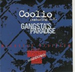
the narrative works by using a series of parrodys. first at the start of the film, during the introduction there is a parrody of 'gangstas paradise' by coolio

l.p. cover of ganstas paradise Next 'Window licker' parrodys 'Singin' in the rain' by Gene kelly by its use of an umberella in some of the dance scenes.

The rest of the film is a basically a giant parrody of the majority of pop music videos currently being created and this constructs the narrative.

Although at the start of the music video the narrative is fairly clear: two sterio typical black 'Gansters' trying to chat up two women and being rejected. although this is a fairly ordinary narrative as soon as the limosine enters the frame and shunts the gangsters cars out of the way the film starts to take a more surreal turn.

Firstly the limo is impossibly long and seems to just carry on coming through the frame in an endless stream, perhaps hinting that the owner of the limo is 'The real deal'. the next strange theme to run through the narrative is that the women appear to have the main charracters bearded face. This is a direct contrast to the majority of other music videos where the female characters are usually very sterio typical sex symmbols.

The rest of the narrative is about this kind of twisted version of the female charcters and yet the two gangsters seem to be persuing them regardless of thier very obvious males faces which could suggest that it is only the audience that can see it.

the filming angles in this piece are generally very ordinary for a music videos, there are alot of mid shots and close ups of the dancers and of the narrative at the start.

However, although the main camera angles of the piece are generally very ordinary the point of most interest is the editing. Throughout the piece the beat is matched almost exactly by the action in the shots, for instance, when the beat is faced the tempo of the editing matched is and vice versa, even more impressive is the fact that not only is the beat matched but also the action in each shot matches the beat and also the pace of the editing.

i like the fact that this video challenges what we as an audience would expect to see from a conventional music video whilst also staying true to some elements, i like how the piece is put together through complex editing and i think that it is one of the best music videos around today.