Wednesday 4 May 2011


Evaluation Task 4: How did you use media technologies in the construction and research, planning and evaluation stages?
Websites, Software and Hardware
Jack and I have mentioned about the equipment we used in this post: http://msrjarnold.blogspot.com/2011/04/shooting-diary-equipment-and-cast.html. I have also made presentation on the technologies which added my project and its development.
Hardware we used included:
-The school computers
-My Laptop
-The two Standard Definition Mini DV Cameras
-iPhones
The school computers are very outdated. They have only (what I estimate to be) 2GB ram. When running powerful software such as the Adobe Suite 3GB ram is the bare minimum for optimal performance. For this reason jack used his Laptop (Acer Aspire 5332) which has more Ram and Adobe CS4, so it was faster and post production was easier. However I wasn’t so fortunate to have the soft wear which would have allowed me to do the same. I completed the post production part of the project/ editing on the school computers using Adobe Premier pro CS3 .
The cameras we used were only SD, but had we been filming on HD I believe the file sizes and compression would have been to much for the school computers and even my laptop at some points. After weighing up the costs and benefits, we decided to use SD.
Our iPhones were very handy at keeping in contact with each other, sending images of locations, being updated with facebook alerts from members of the group (the free alternative we used to texting). They also allowed us to get access to the internet when on location, so we didn't have to leave set to get the information we needed.
Software we used included:
-Adobe Premier Pro CS3
-Adobe After Effects CS3 + CS4
-Adobe Photo Shop CS3
-Microsoft Outlook
Microsoft Outlook allowed us to communicate with each other within school, send files and links.
Adobe Premier Pro was the non-linear editing software we used to cut footage to the music and get basic effects and transitions completed.
Adobe After Effects was the 2.5D motion graphics and compositing software jack and I used to create all of the advanced effects in our film such as the clones and gun fire.
Adobe Photoshop was mainly used by Louis in order to create the Digipack and alter the photos from the photo shoot. It has a huge variety of photo editing tools that Louis was able to use to get the look just right for our Ancillary task.
Websites we used included:
www.blogger.com
www.youtube.com
www.facebook.com
www.voki.com
www.google.com
www.flicker.com
www.vimeo.com
We were able to use facebook to talk to one another, share links, images, ideas, videos and create events for when we had to film. This was essential for getting everyone organised. This is also useful because it is completely free and we all used it prior to the music video. We were also able to use it to get our finished products out to an audience of 1000's who (most) are our target audience.
Youtube gave us access to hundreds of music videos of the same genre that we were able to analyse and get inspiration from. We were able to look at what worked and what didn't work from other videos and incorporate our favourite bits and make them our own.
Youtube was also what we used as a sounding board for our own ideas. We uploaded an early scene we had recorded to get some audience feedback.
We were able to then get feedback from a wide audience. We gathered from the "likes" it received and a comment saying: "Looks great but must have taken an age.", that people thought it looked good. We therefore kept it in our end product.
Vimeo was used much like youtube, however the videos on vimeo are a lot more "semi-professional", it is mainly full of people who have made their own videos and are using it as a professional video hosting site. This enabled us to look at music videos made on a zero budget, unlike the ones we had been watching by The Prodigy and Chase & Status.
Blogger was used in order to keep an up to date diary of everything we had done in relation to the projects and also evaluate it.
I receive my Gmail emails straight to my iPhone, and my Youtube account is connected to my Gmail. This convergence of technology allowed for me to be instantly informed when someone had provided feedback on our video. This was very useful in the evaluation stage as I was able to write about the feedback people had given just as fast as I had received it.
In conclusion, it would have been impossible to get the projects done to the standard they are with out the use of the aforementioned technologies
Tuesday 3 May 2011
Monday 2 May 2011
evaluation question 2
How effective is the Combination of Your Main Product and Ancillary Texts?
The combination of our main product and ancillary texts work to a great effect as it has been our aim to keep a sense of consistency throughout all of them. This is because we have tried very hard through this course to keep the continuity through everything that we make. Our front cover on our digi pack is the white mask with the pink effect on the brick wall background. This combined with the white mask which is very elusive throughout our film, but still very much a part of our product, has a great effect because throughout the film the mask is very hard to spot and is almost subconscious to the audience. So by putting it as our front cover it proves that it is apparent and also helps keep the consistency throughout our products.
This is also put to great effect as we combined it with our internet site, keeping the consisntancy throughout to maximise the effect of this white mask, which we have almost taken to be our own individual trade mark. Which every band needs, such as the prodigy have the ant logo on all of their newer work. This helps us create and maintain our own brand across all of our work and any future work we would create, by placing this white mask in all of our work our audience can instantly recognise it and know that it is a product of ours. This sense of branding that we have created is very individual to us; however we did take a lot of influence from two bands, Slipknot and Hollywood Undead. Both of which are popular for wearing masks in all of their video’s and other media products such as websites and posters. This hampers our individuality a tad, but the plain white mask that we have used throughout all of our media products has become our own. However at the same time we try and keep with in our genre of music which means that we can not break away from all conformities to much otherwise we will not be resembled with the genre that we aim to be in. So our branding is individual but yet at the same time it fits within the conformity of our genre which limits our individuality.
Also we tried to keep the colour scheme throughout everything to also aid with the consistency, This combination works well and to a great effect as it helps to make our work look professional and consistent
 .
.
In conclusion I believe that the effectiveness of our combined media products is great as there is a noticeable and consistent link between all of the work we have produced. This aids in the creation of our own unique and distinct brand and therefore helps create a professional and well planned feel to our work.
Which is what we aimed to achieve overall.
The combination of our main product and ancillary texts work to a great effect as it has been our aim to keep a sense of consistency throughout all of them. This is because we have tried very hard through this course to keep the continuity through everything that we make. Our front cover on our digi pack is the white mask with the pink effect on the brick wall background. This combined with the white mask which is very elusive throughout our film, but still very much a part of our product, has a great effect because throughout the film the mask is very hard to spot and is almost subconscious to the audience. So by putting it as our front cover it proves that it is apparent and also helps keep the consistency throughout our products.
This is also put to great effect as we combined it with our internet site, keeping the consisntancy throughout to maximise the effect of this white mask, which we have almost taken to be our own individual trade mark. Which every band needs, such as the prodigy have the ant logo on all of their newer work. This helps us create and maintain our own brand across all of our work and any future work we would create, by placing this white mask in all of our work our audience can instantly recognise it and know that it is a product of ours. This sense of branding that we have created is very individual to us; however we did take a lot of influence from two bands, Slipknot and Hollywood Undead. Both of which are popular for wearing masks in all of their video’s and other media products such as websites and posters. This hampers our individuality a tad, but the plain white mask that we have used throughout all of our media products has become our own. However at the same time we try and keep with in our genre of music which means that we can not break away from all conformities to much otherwise we will not be resembled with the genre that we aim to be in. So our branding is individual but yet at the same time it fits within the conformity of our genre which limits our individuality.
Also we tried to keep the colour scheme throughout everything to also aid with the consistency, This combination works well and to a great effect as it helps to make our work look professional and consistent


In conclusion I believe that the effectiveness of our combined media products is great as there is a noticeable and consistent link between all of the work we have produced. This aids in the creation of our own unique and distinct brand and therefore helps create a professional and well planned feel to our work.
Which is what we aimed to achieve overall.
Sunday 1 May 2011
Evaluation question1
In what ways does your media product use, develop or challenge forms and conventions of real media products?
Throughout the production of both our main and ancillary tasks we have aimed to develop on and take the conventions of electronica music videos and productions further. During our research into other music videos and products within the electronica/bass genre we realised that alot of the videos have similar themes running through them (drugs, violence etc etc). This informed our own video as in order to develop the convention we found it necessary to first work with convention and then begin to work on taking the stereotypical ideas further.
This is the Chemical Brother's video for "Believe". throughout the video the main protagonist is hallucinating about completely normal objects (namely factor machinery) chasing him down. This has a strong link to our own music video because our own narrative also focuses on a main protagonist being pursued by his own clone which is equally as improbably as being chased by machinery. I think that our video is just as effective at portraying this sense of the improbably coming to life in someones mind, our use of quick cuts to frames of a white mask or of a person being where they weren't a single frame before create a confused feeling throughout our film which i think helps to contribute towards this. I do, however, think that our narrative could have been slightly better constructed to allow our film to move through a passage of time more obviously as i feel that at points our film gets a bit "stuck" on one scene (for example the bathroom scene) and this sometimes slows the pace of our film down. This is an issue with our music video because a fast moving narrative seems to be integral to quite a few other videos in the same genre as ours, for example the Chemical Brothers video. On the other hand i think that the reason that the bathroom scene drags on for a bit too long it because it is the moment that we introduce the audience to the main characters alter ego so it was important for us to show this moment clearly.
Another convention that is shown in many other electronic videos is rhythmic editing and quick cutting. this can be seen in the videos below:
Aphex Twin's Rubber Johnny
Aphex Twin's Window Licker
Square pusher's Come on my selector
Throughout all of these music videos editing is used to increase the pace of the video whilst also giving the video brilliant continuity with the music that it is based on. For instance in the Come On My Selector video there is a fight scene between 4:04 and 4:39. Throughout this scene the video is cut exactly to the music. Also in the Window Licker video after 1:17 the video follows the pace of the music with the pace of both the footage used and the editing on the footage. In our own video we have used this idea throughout. We tried to cut our video as closely to the music as we could whilst still allowing the film to flow from one scene to the next. I think that this worked well in our video, however we struggled at times to make our rhythmic editing fit the footage as well as some of the examples above. This can be seen in our video right at the start where some of the cuts were slightly out of time with the footage and i think that this is a bit of a short fall of our video. Having said that, the over all "feel" of the editing on our music video is very much in keeping with the conventions of the other videos above.
Ancillary tasks.

I think that our digipak that i created both challenges the conventions of other album covers and artwork but also works with some of the ideas that i have seen in similar products.
For example it was very important that the digipak stood out and i spent alot of time changing the look of it to achieve this (see "creating the digipak"). I think that the work i put into making the images "pop" payed off as i think it makes my product stand out clearly. A couple of examples of existing CD covers that work really well in this way are below:


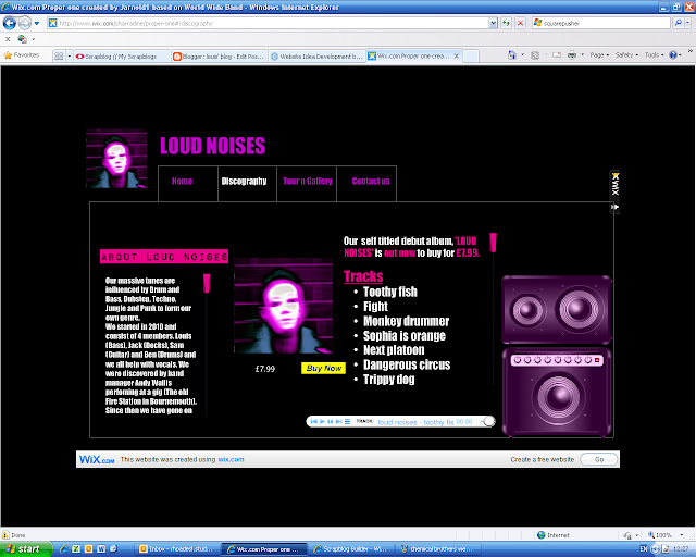
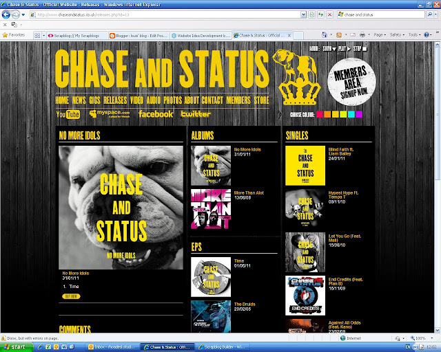 For instance the chase and status website uses the same colour scheme as the one in the album cover shown within the website itself. We therefore decided that it would be important for our website to follow suit:
 I think that this matching of colour works really well with our website and album cover, it helps the band image to become more defined because all of our products fit together and have a similar look to one another. However there were some issues with our website in that the aesthetics of it are not completely in keeping with other products, an example of this is that the text on the loud noises website isn't as big as those on the websites of the other bands this means that our website doesn't quite have the initial impact that seems to be quite important in the other example below:

Throughout the production of both our main and ancillary tasks we have aimed to develop on and take the conventions of electronica music videos and productions further. During our research into other music videos and products within the electronica/bass genre we realised that alot of the videos have similar themes running through them (drugs, violence etc etc). This informed our own video as in order to develop the convention we found it necessary to first work with convention and then begin to work on taking the stereotypical ideas further.
This is the Chemical Brother's video for "Believe". throughout the video the main protagonist is hallucinating about completely normal objects (namely factor machinery) chasing him down. This has a strong link to our own music video because our own narrative also focuses on a main protagonist being pursued by his own clone which is equally as improbably as being chased by machinery. I think that our video is just as effective at portraying this sense of the improbably coming to life in someones mind, our use of quick cuts to frames of a white mask or of a person being where they weren't a single frame before create a confused feeling throughout our film which i think helps to contribute towards this. I do, however, think that our narrative could have been slightly better constructed to allow our film to move through a passage of time more obviously as i feel that at points our film gets a bit "stuck" on one scene (for example the bathroom scene) and this sometimes slows the pace of our film down. This is an issue with our music video because a fast moving narrative seems to be integral to quite a few other videos in the same genre as ours, for example the Chemical Brothers video. On the other hand i think that the reason that the bathroom scene drags on for a bit too long it because it is the moment that we introduce the audience to the main characters alter ego so it was important for us to show this moment clearly.
Another convention that is shown in many other electronic videos is rhythmic editing and quick cutting. this can be seen in the videos below:
Aphex Twin's Rubber Johnny
Aphex Twin's Window Licker
Square pusher's Come on my selector
Throughout all of these music videos editing is used to increase the pace of the video whilst also giving the video brilliant continuity with the music that it is based on. For instance in the Come On My Selector video there is a fight scene between 4:04 and 4:39. Throughout this scene the video is cut exactly to the music. Also in the Window Licker video after 1:17 the video follows the pace of the music with the pace of both the footage used and the editing on the footage. In our own video we have used this idea throughout. We tried to cut our video as closely to the music as we could whilst still allowing the film to flow from one scene to the next. I think that this worked well in our video, however we struggled at times to make our rhythmic editing fit the footage as well as some of the examples above. This can be seen in our video right at the start where some of the cuts were slightly out of time with the footage and i think that this is a bit of a short fall of our video. Having said that, the over all "feel" of the editing on our music video is very much in keeping with the conventions of the other videos above.
Ancillary tasks.

I think that our digipak that i created both challenges the conventions of other album covers and artwork but also works with some of the ideas that i have seen in similar products.
For example it was very important that the digipak stood out and i spent alot of time changing the look of it to achieve this (see "creating the digipak"). I think that the work i put into making the images "pop" payed off as i think it makes my product stand out clearly. A couple of examples of existing CD covers that work really well in this way are below:
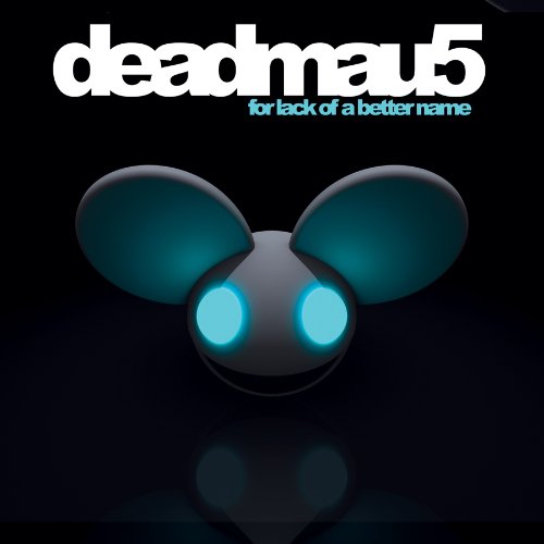
Even though i think that the Loud Noises digipak fits in well to other artwork in the genre i also think that it challenges the same conventions. For instance, there are not many other album covers that i have come across during my research that use black and white images so strongly. In fact, with the exception of the two examples below, i found that most other album covers were very preoccupied with strong colour.


On the other hand, im not sure how much this usage of black and white helped towards the overall effectiveness of our digipak as a whole. I think that using a bit more colour in the main panel at the top would have helped to link it into the rest of the artwork better as the pink face doesn't seem quite enough to link it all together. Also, the monochrome of the dog image makes the text harder to read which in some ways defies the point of having text there in the first place. To improve the digipack overall i would have liked to work a bit more on the grading and contrast of the images a bit more to make it all fit together better.
Our other ancillary task was to create a website. As soon as we started to research existing band websites it became clear that the main focus of these websites was to promote the band image and current releases:


Overall i think that our website is a good match up to the existing websites from band in the same genre. I do, however, think that given more time and work we could have made the website have a better, more professional feel which would allow it to align itself more closely with the current conventions for websites in this genre.
Subscribe to:
Posts (Atom)